Identity for The Culture.
The Culture is a Brooklyn based safe space where people of color can be introduced to and practice kink play. The brand is representative of carefree Black Joy in a scene where they largely are underrepresented and fetishized. It is a place for themselves where they can be themselves. The goal is to create an identity that accurately encompasses all of this, while targeting the 20 to 35 year olds looking for a place in the scene.
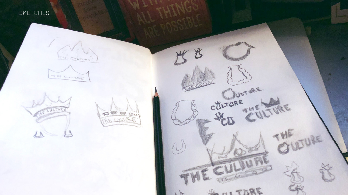
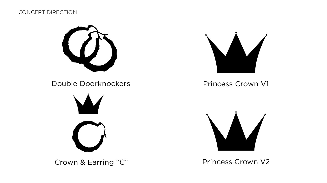
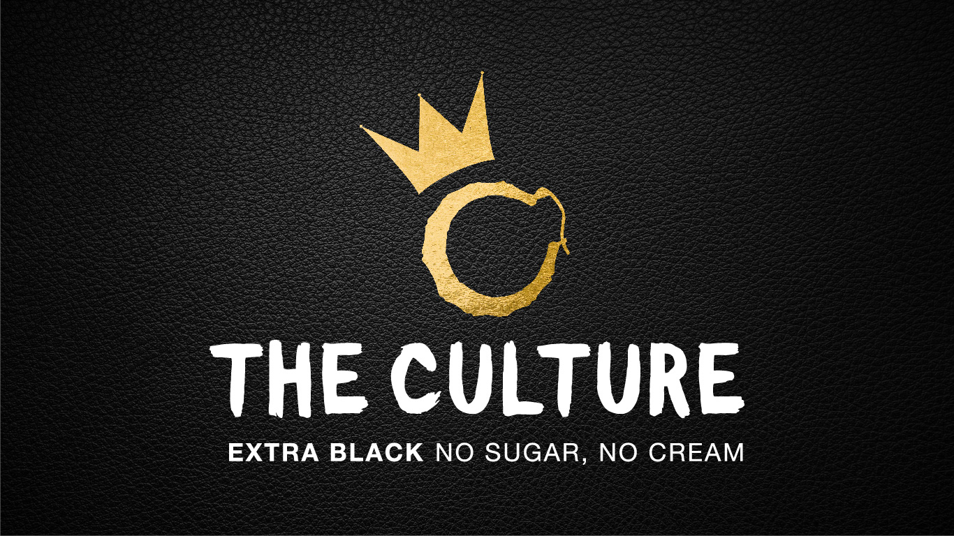
Early drafts played with the idea of using door knocker earrings for letters as a representation of 90’s culture for people of color. The crown is another aspect of this culture, exemplified by the tilted crown in the widely know Biggie Smalls portrait. The crown also represents the princess subculture of dom and sub relationships, subtly alluding to the true nature of The Culture.
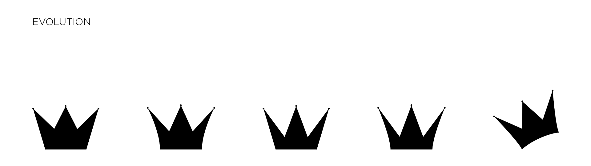
The Princess Crown went through a few different iterations over time. The current version takes inspiration from the famous Basquiat crown as well as the princess crown commonly found in imagery of women of color. Basquiat’s crown has a straight edge with short points while the princess crown has longer points with curved edges. A balance was struck between the two to use as the main crown for the brand, representing The Culture.
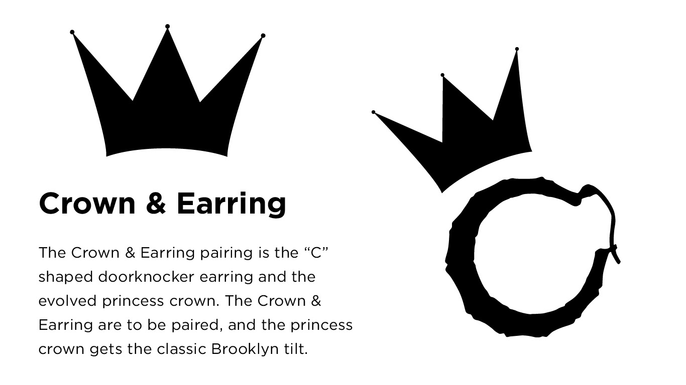
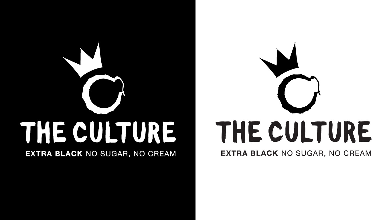
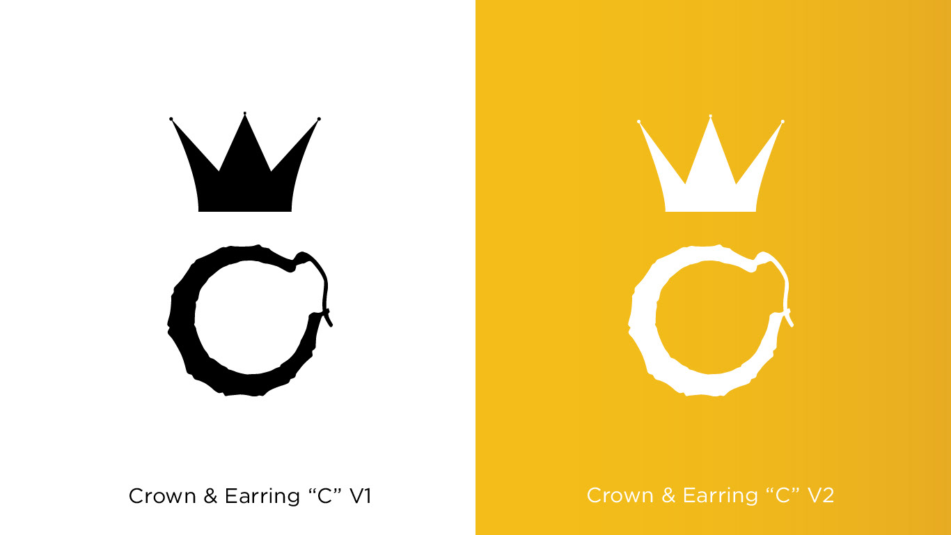
The brand mark evolved into this Crown & Earring pairing over many iterations.
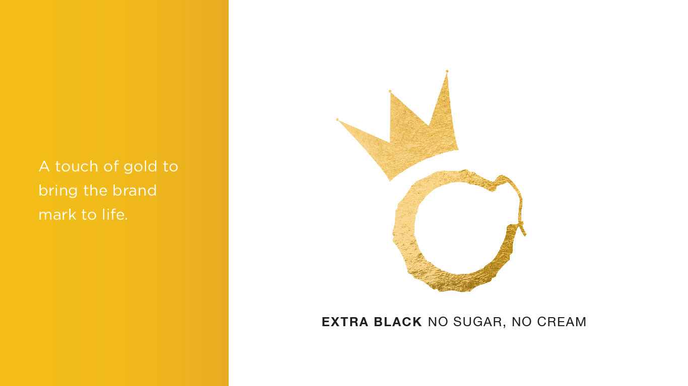
Gold foil was used as both a pop of color and as a print idea for the brand mark. The tagline was also added in and uses two font weights for more contrast. The use of contrasting font weights also plays up to the idea behinds the tagline itself.
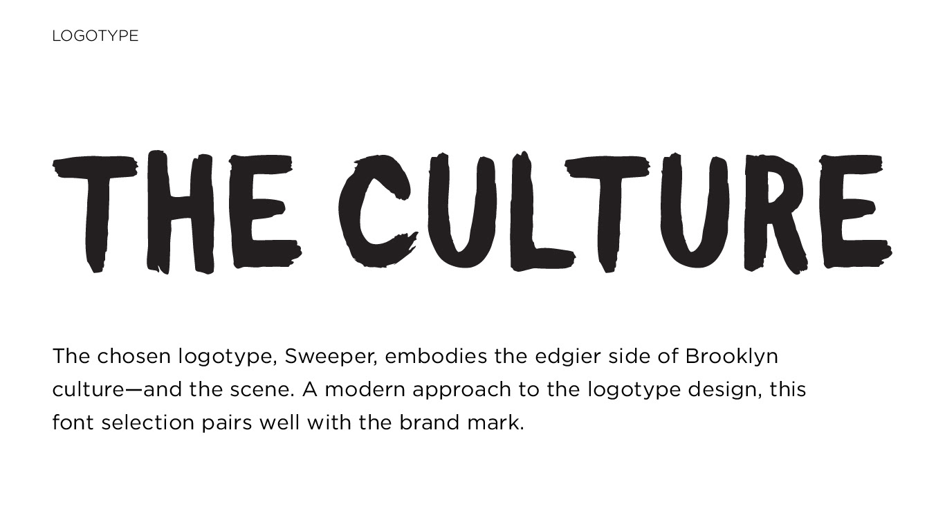
The logotype font was chosen and then I explored different versions of the logo lockup:

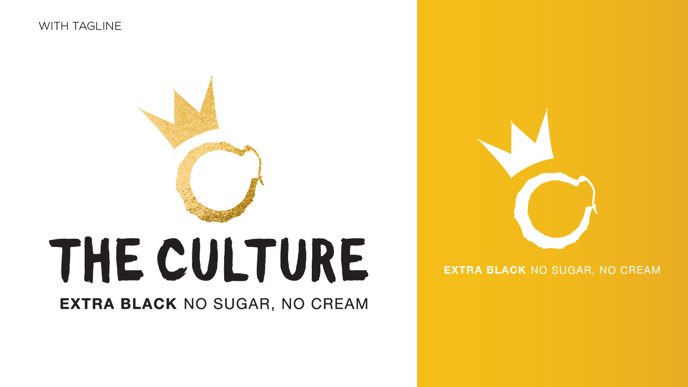
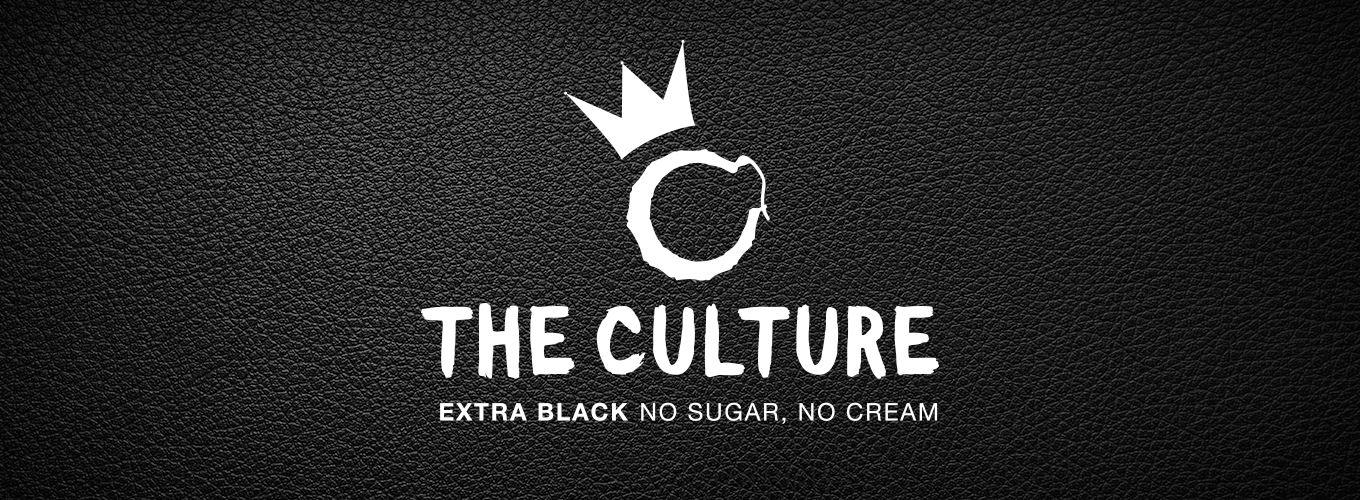
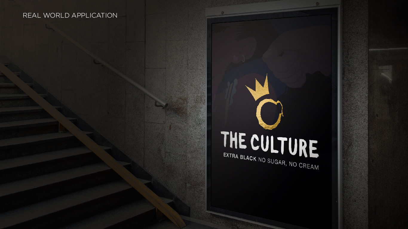
Ultimately the Crown & Earring logo lockup became the official lockup for The Culture's brand identity. I then created mockups of different ways the lockup could be used:

Single color logo lockups: